
You walk into a room and something just feels right. Everything clicks—the colors, the furniture, the glow of light bouncing off the walls. It’s not just good luck or an expensive decorator at play. There’s a method to this magic, and it’s what interior designers whisper about: the golden rule in interior design. Now, this isn’t an ancient scroll you need to decipher, but it is the one guideline that makes or breaks how a space feels and functions. So, what is it, and why do interiors pros like me follow it almost religiously?
The Heart of the Golden Rule: Balance Above All
Okay, here’s the unfiltered truth—golden rule interior design isn’t about a single color palette, expensive furniture, or following TikTok trends. It’s about balance: getting the right mix of scale, proportion, and harmony in any space. Think of a see-saw in a playground—stick a big adult on one side and a toddler on the other, and it just won’t work. Rooms are the same. Too much weight (visually or literally) on one side and everything feels off.
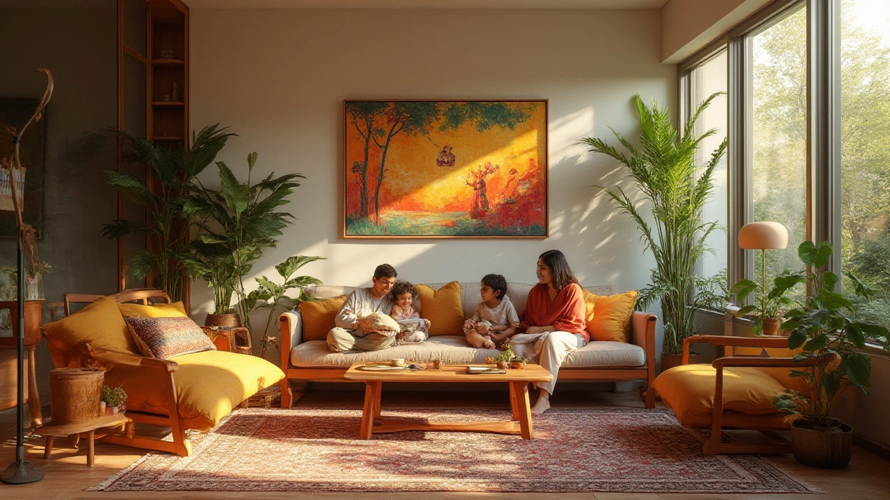
Balance shows up everywhere. Let’s talk about symmetry for a second. People love symmetry—there’s a big old comfort in seeing matching lamps on either side of a bed or an even grouping of pictures on a wall. Most brains crave that subtle order. But perfect symmetry can get boring fast. Enter asymmetrical balance. You might put a large sofa on one side of your living room, then balance it with a tall bookshelf and a cluster of plants on the other. Not matchy-matchy, but balanced? Absolutely.
Scale and proportion are best friends in this equation. Ever been in a tiny room with a huge armoire? It dominates the space and makes you feel boxed in. Or, maybe you’ve seen a massive open-plan living room with tiny, doll-sized chairs. It just doesn’t work. Professional designers always consider furniture size in relation to room size. There’s a classic ratio lots of us stick to: leave about 18 inches between coffee tables and sofas; make sure your rug is large enough to reach under at least the front legs of all major furniture pieces. These aren’t just fussy details—they help everything flow.
| Element | Recommended Measurement | Why It Matters |
|---|---|---|
| Space between sofa and coffee table | 18 inches | Easy movement and comfort |
| Distance between art and furniture | 6-10 inches above furniture | Keeps art visually connected to furniture |
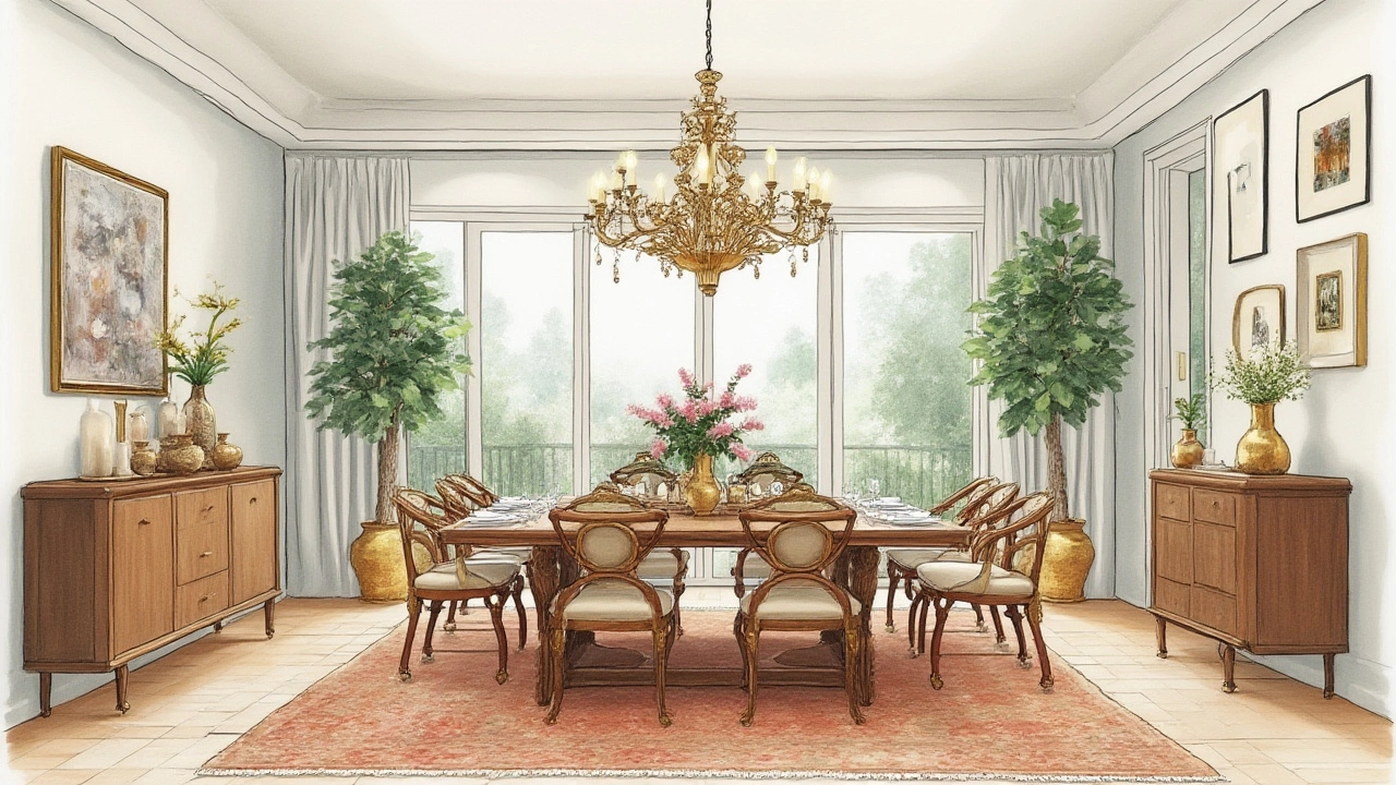
| Artwork hang height (from floor to center) | 57-60 inches | Eye-level for average viewer |
| Rug size under a dining table | At least 24 inches beyond table edge | Chairs stay on rug when pulled out |
Let’s get real: not every space is a perfect rectangle with straight lines and even walls. That’s where the magic of the golden rule comes in—it’s about doing what feels balanced for the people using the space. If you love to curl up by a window, arrange your favorite chair—and don’t be afraid to bend the rules if it means you’ll use that spot more. The pros might call this “functional balance,” but I just call it living your best life at home.
Did you know the concept of the golden ratio goes all the way back to ancient Greece? Yep, our ancestors used that 1.618 ratio to build everything from the Parthenon to their pottery, believing it’s the most pleasing proportion nature has given us. Today, it still turns up in design—the perfect rectangle for a table, the ideal layout for shelving, even the way we style coffee tables by grouping items in threes. Designers will often secretly measure with this ratio for the most pleasing-to-the-eye results.
If you’re thinking, “But Eliot, what about color, light, or layout?” you’re right on track. Those all matter, but without balance as your foundation, the other rules can’t work their magic. My tip: invest in a large mirror if your room feels lopsided or cramped. It bounces light and gives instant symmetry without buying new furniture. Or, use floor lamps to visually lift a low-ceilinged space. These tiny balance tricks aren’t just for show—they change how you experience every day at home.
Making the Golden Rule Work in Real Homes
Balance isn’t just a word for magazine spreads. Run a quick experiment: walk into your living room, close your eyes, then open them fast and look around. What grabs your eye? Is everything concentrated in one section? Are the colors or textures jarring? It’s your gut telling you the golden rule needs some attention. The best part: you don’t need a fancy budget to fix things. Sometimes you only need a rearrange, not a replacement.
Think about the triangle method for furniture placement, especially in living rooms. Picture your sofa, coffee table, and main chair as the corners of a triangle, with just the right distance for easy conversation and movement. This isn’t random—it’s a layout seen everywhere from Parisian apartments to cozy Yorkshire cottages, because it simply works for the way people talk and connect.
Texture plays a big role in the balance game too. If your couch is super smooth leather, add a chunky knit throw or woven basket. If everything is hard—wooden floors, metal lamps—soften the feel with textiles underfoot or a few oversized cushions. Even an effortlessly messy book stack can give that “lived-in” balance, making a polished space feel homey, not sterile.
Color comes next. Too many bold colors can compete with each other, while none at all can leave a room flat. Try the 60-30-10 rule: 60% of a dominant color (like the main wall paint or your big sofa), 30% a secondary color (think rugs or curtains), and 10% as the accent (cushions, art, or vases). Your eyes get a sense of order, even if they don’t consciously register the numbers.
Natural light changes everything. It brings out colors and creates shadow and interest. Pay attention to the way light moves through your space during the day—it might mean putting your reading chair where the morning sun hits, or shifting a houseplant that’s getting scorched at noon. Sometimes, moving a curtain rod up just a few inches can trick your eyes into thinking ceilings are taller or windows are grander.
Now for practical tips that pros never skip:
- Hang artwork at eye-level. If you’re not sure, use 57-60 inches from the floor to the center of the piece. This echoes museum display standards.
- Don’t snuggle all your furniture up against the walls. Pull sofas and armchairs in even just a few inches to create instant intimacy.
- If your rug is too small, layer it over a larger jute or flatweave rug for added texture—and balance.
- Group accessories in odd numbers (especially threes) for instant visual interest—candles, books, vases, you name it.
- Use mirrors across from windows to bounce natural light deeper into your room.
Still not sure if you’ve got the balance right? Snap a photo of your space and look at it on your phone. It’s wild how much easier it is to notice what's off in a picture than with your own two eyes. And hey, if it still feels off-balance, sometimes less is more. Declutter, donate, or just put away one or two pieces, then see how the room feels. Visual noise is often the sneaky culprit in an unbalanced space.
Let’s talk about exceptions, because—as any rule-breaker will tell you—sometimes breaking the rules delivers the best results. Maybe your taste runs to maximalism—more color, more pattern, more ‘stuff’. You can still be balanced by grouping similar items or keeping to a limited (but bold) color theme. Or, maybe you crave wide open, minimalist rooms with only three pieces of furniture. The golden rule still applies: these pieces need to relate in scale, purpose, and placement.
The Golden Rule and Your Lifestyle: More Than Just a Pretty Space
The golden rule in interior design isn’t just about impressing your friends or curating the ultimate Instagram backdrop. It’s about shaping your routines and the way you feel at home. Ever notice how some spaces make you relax instantly, while others seem to spur you into cleaning or rearranging nonstop? That’s balance at work—or, all too often, the lack of it.
Kitchens need balance between unused décor and actual workflow. The triangle method comes back here, with the classic 'work triangle' between stove, sink, and fridge. You don’t want to hike a marathon every time you whip up an omelet, right? Ergonomics meets aesthetics when everything has its reachable place, with enough breathing room for a friend to perch at the counter.
Bedrooms, meanwhile, are the ultimate sanctuary. You want your bed to be the star—a headboard centered on your main wall, with nightstands or sconces flanking it for symmetry. Even if your room is tiny? Use paint or wallpaper behind the bed to frame it. The balance here isn’t just visual, it’s emotional. Studies by The Sleep Foundation hint that balanced, uncluttered rooms can even boost sleep quality and lower stress.
Kids’ rooms? Different beast. Here, the golden rule means flexibility. Low shelves invite independence, movable storage keeps chaos at bay, and bright colors add playfulness—but limit intense hues to one wall or a handful of accessories so things don’t turn clownish. The same principle applies: balance, scale, and a little space to move.
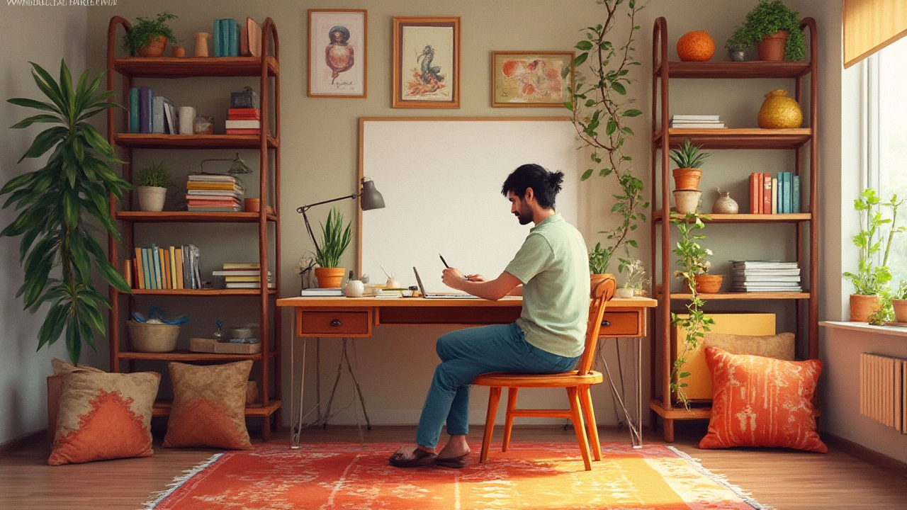
Let’s not forget home offices—2020 and beyond made these a fixture. Most successful spaces here feature an L-shaped layout or a perpendicular arrangement, placing desk and storage within natural reach. Too many distractions behind the computer, and you’ll never focus. Smart designers use the golden rule to keep essentials close, while giving the rest of the room enough open space for quick stretching or a mental break.
Want to add a finishing touch? Biophilic design, meaning plants and natural elements, is trending in 2025 for good reason. They relax the mind and bring out the best in your home’s existing colors and textures. But too many plants crammed into a tiny space and you’ve got a greenhouse, not a chill zone. Check your plant babies: one to three in an average room, grouped if you want impact, spaced out if you want calm. Again—balance has your back.
Here’s a cool fact: a 2023 survey by Houzz reported that over 70% of homeowners feel happier in a room they’ve personally rearranged for balance than one decorated by someone else. Turns out, getting your hands dirty and playing with your layout sparks a deeper sense of belonging.
If you hit a wall (literally or creatively), phone a friend, swap ideas, or peek at design hashtags for inspiration. But always listen to that nagging feeling—when something seems off, it usually needs a tweak for balance. Don’t let trends or influencers convince you there’s only one right look. Your lifestyle, your personality, your needs—they’re the real test.