
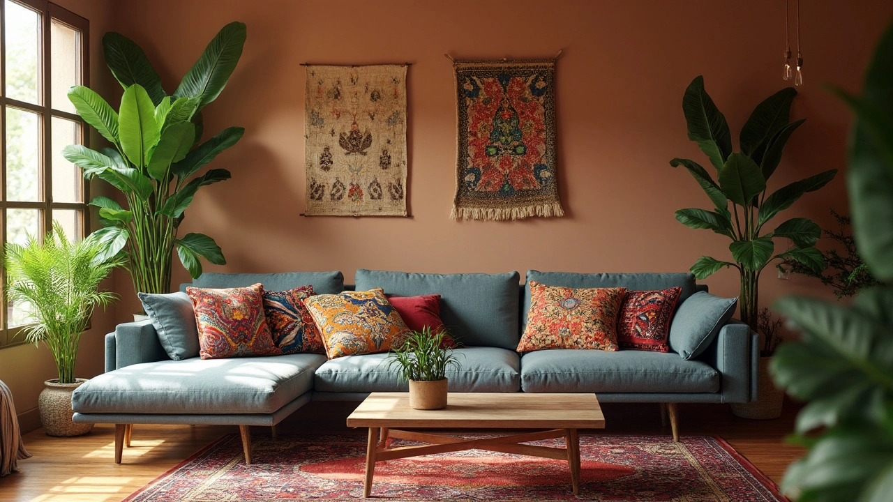
So, you've got a grey couch and you're staring at your living room thinking it could use a little pick-me-up. Throw pillows are a simple way to add some flavor. The great thing about a grey couch is that it's super versatile; it's like a blank canvas begging for a splash of color.
Let's dive into color theory a bit. Grey is neutral, which gives you the freedom to explore various hues. If you're feeling adventurous, bold colors like mustard yellow, teal, and even bright red can create fantastic contrast and make the couch pop. It's all about personality here.
On the flip side, if you're aiming for a softer vibe, you might want to stick with pastel shades. Think blush pink or mint green, which can soothe and calm the space around the couch. These colors work wonders if you're going for a relaxed, peaceful atmosphere.
- Understanding Color Theory with Grey
- Bold and Bright Choices
- Soft and Subtle Tones
- Mixing Patterns and Textures
Understanding Color Theory with Grey
Grey is like the chameleon of the color world. It's neutral, it's versatile, and it can work with just about anything—which is precisely why it's a popular choice for sofas. But how do you make it pop with the right throw pillows? Let's break it down using a bit of color theory magic.
Complementary Colors come into play here. These are colors found on opposite sides of the color wheel. Pairing your grey couch with something bold like orange or yellow can create a striking effect. The contrast stands out, giving your living room an instant boost of personality.
Analogous Colors are those located next to each other on the color wheel. Choose shades like blue or purple for a comfortable yet sophisticated look. They blend smoothly and don't create as much visual tension as complementary colors do.
Color Psychology
The impact of colors goes beyond just aesthetics. Colors can influence our mood and behavior. Pairing grey with blue pillows can create a calming effect, perfect for chill-out zones. Using red, on the other hand, can energize and add excitement.
Balance and Harmony
While selecting throw pillows, maintaining a balance is key. If you're opting for bright hues, consider the rest of your room. Your pillows should complement the environment, not clash with it. The trick is to achieve harmony without overwhelming the senses.
Remember, there's no one-size-fits-all here. Your space should reflect your style and what makes you comfy since that's what home's all about, right?
Bold and Bright Choices
Feeling bold? Adding throw pillows in striking colors to your grey couch can completely transform the vibe of your living room. Bright colors not only create a point of interest but also reflect a lively and energetic atmosphere.
The Power of Contrasting Colors
Colors like mustard yellow, teal, and even a daring bright red are fantastic for creating contrast. These shades stand out against the neutral backdrop of a grey couch, offering a vibrant look that can energize the entire room.
- Mustard Yellow: This color is great for adding warmth. It's cheerful without being overpowering, and it pairs exceptionally well with the cool tones of grey.
- Teal: For a more adventurous feel, teal can bring a modern and trendy vibe. It's a bit unexpected but works well in modern aesthetics.
- Bright Red: This is the go-to if you seek to add passion and energy. It can be a bit bold for everyone, but it's incredibly effective if you want a focal point in the room.
How to Balance Bold Colors
While the temptation is there to go all out, it's important to not overwhelm your space with too many bold colors. A handy tip is to mix these colors with neutral pillows or maintain a consistent color theme across the room, like repeating the color in a rug or art.
Another trick is to incorporate patterns and textures within your bold colors. Patterns like geometric shapes or bold stripes can add an extra dimension and stop the colors from feeling flat.
A Splash of Stats
Did you know that according to a home decor survey, 65% of people under 35 prefer bold colors as their first choice for accent pillows on grey furniture? It might be because bold colors feel fresh, trendy, and express personal style exceptionally well.

Soft and Subtle Tones
Looking to create a cozy and inviting vibe around your grey couch? Soft and subtle tones might just be your go-to. These colors are like a warm hug, adding tranquility to your living space without overshadowing the existing decor.
Why Go Soft?
Soft tones like blush pink, pastel blue, and mint green pair beautifully with a grey couch. They introduce a hint of color that's not overwhelming, making them ideal for creating a calm, soothing environment. It's perfect for those Sunday afternoons when the couch becomes your best friend.Combining Subtle Shades
Mix and match different soft shades to add some depth without cluttering the look. You could combine lavender and soft yellow or go for creamy white and pale aqua. Using multiple pillows in various sizes and shapes can also add texture, while keeping the palette light and airy.Patterns and Materials
Don't shy away from patterns, even with subtle tones. A light geometric or floral design can add interest without being too busy. Think about materials too—velvet or linen in soft shades can introduce a touch of luxury and comfort.If you're after a balanced, harmonious look, soft tones can make your corner sofa the ultimate relaxation spot. You'll have a room that invites relaxation and conversation in equal measure.
Mixing Patterns and Textures
Mixing patterns and textures on your grey couch with different throw pillows is like dressing the couch up with a personality of its own. Start by understanding that it’s all about balance. You don't want to overwhelm the senses, but rather create an interesting visual landscape.
Here's a quick tip: Stick to a single color palette but vary the patterns and textures. For example, if you're using three pillows, make one a large, bold pattern, another a medium-sized geometric print, and the third a subtle texture like herringbone or knit. This keeps things coordinated without being matchy-matchy.
Think About Scale and Size
Play with the size of your patterns. If you're introducing a busy pattern with lots of colors, pair it with simpler, less detailed designs. This way, the space doesn’t feel too chaotic. The closer you are to bright and bold choices, the more you might want a couple of toned-down companions.
"When it comes to home decor, textiles are the easiest way to add interest and personality without a big investment. They can change the feel of a room almost instantly" — Emily Henderson, Interior Designer
Textures add depth, too. Think about mixing a velvet pillow with a cotton one or adding a faux fur pillow for a touch of luxury. If you're undecided, try a popular combination where three pillows each have a different texture but share a common color.
Patterns: Solids, Stripes, and Florals
- Stripes: Classic and timeless. They can break the monotony and add a linear aspect to the decor.
- Florals: These can be laid-back and romantic, perfect for adding softness.
- Solids: Never outdated, they provide a base that links everything together.
Remember that balance is key. Too many patterns can overwhelm, but a thoughtful mix, unified by a color scheme, creates harmony on your corner sofa. Take a step back to see the overall effect, adjusting the arrangement if one pattern seems too dominant. Happy decorating!