TV Stand Aesthetics: How to Choose, Color, and Match for a Stunning Living Room
If your TV stand looks like an afterthought, the whole room feels off. A well‑designed stand can pull together sofas, coffee tables, and décor while keeping the tech tidy. The good news? You don’t need a designer degree to make it work. Follow these quick, practical steps and watch your living space transform.
Select the Right Color and Finish
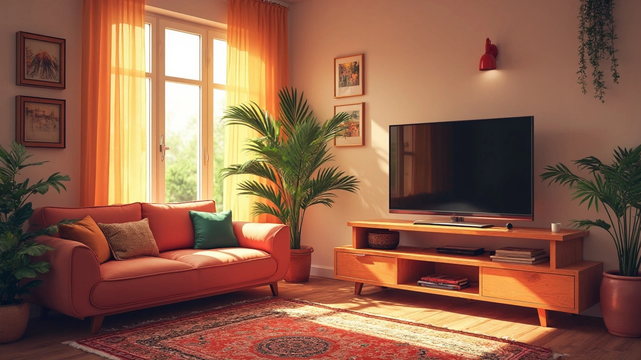
The easiest way to boost a TV stand’s look is picking the right hue. Light wood tones add warmth and keep the room feeling airy, while dark walnut or charcoal creates a sleek, modern vibe. If your walls are neutral, a bold pop‑color—think navy or matte black—makes the stand a focal point. Remember to test a sample under your room’s lighting; natural light can turn a deep gray into a cool blue.
Matching finishes also matter. A glossy lacquer pairs well with chrome legs and glass accents, whereas a matte matte paint looks great beside matte metal frames or woven baskets. Keep the finish consistent with other furniture pieces; a mixed‑finish look can work, but only if you repeat the materials elsewhere (like a coffee table with a similar metal base).
Match with Your Sofa, Coffee Table, and Rugs
Think of your TV stand as the middle piece of a visual puzzle. If your sofa is a soft gray fabric, a light oak stand will contrast nicely without clashing. For a bold sofa—like emerald green or mustard—choose a muted stand color to let the couch shine.
When it comes to coffee tables, ask yourself: should they match or complement? Matching gives a uniform, built‑in feel. Complementing adds interest; for example, a glass‑top coffee table with sleek metal legs looks great next to a wood‑grain TV stand. The key is staying within the same style family—mid‑century modern, industrial, or coastal.
Rugs can anchor the whole setup. A rug that stretches under both the TV stand and coffee table ties the area together. Aim for a size that leaves at least 12‑inch border around the furniture for a balanced look.
Mind the Height and Width
Height matters for comfortable viewing. Your TV’s center should be at eye level when seated, usually 42‑48 inches from the floor for a 55‑inch screen. Measure your TV and pick a stand that leaves a small gap (about 1‑2 inches) between the bottom of the screen and the top of the stand.
Width is just as crucial. The stand should be at least as wide as the TV, but a little extra width gives you room for speakers, décor, or a decorative tray. If space is tight, consider a narrow console that still supports the TV’s weight.
Style Details that Make a Difference
Small touches can elevate the whole look. Add a decorative bowl, a stack of art books, or a plant on the top shelf for personality. LED strip lighting behind the stand creates a subtle backlight that reduces eye strain and adds a modern glow.
If you like the idea of a wall‑mounted look, check whether your stand’s legs can be removed or if the model is designed for mounting. Not every stand is safe for wall mounting; look for reinforced frames and follow the manufacturer’s weight limits.
Finally, keep cables hidden. Use a cable management box or route wires through built‑in holes. A clean, cable‑free silhouette makes the stand appear lighter and more intentional.
With color, finish, matching pieces, and thoughtful details in mind, your TV stand can become the stylish anchor of your living room instead of a hidden box. Try one change at a time, see what clicks, and enjoy the fresh look you’ve created.
Best Colors for TV Stands: What Works for Your Space and Screen
Choosing the right color for your TV stand can elevate your viewing experience and harmonize your space. This article explores the best color options that work with your living room layout, TV model, and overall home aesthetic. Discover interesting facts about color psychology and practical tips for selecting a TV stand that complements your decor. Whether you prefer bold statements or subtle blends, find the perfect balance between style and function.


